Task
Analysis of geo-data, visualisation
With visualisations of geodata, you gain new insights into complex interrelationships and maintain an overview. Three- and two-dimensional visualisations can highlight your GIS and geodata in a generally understandable and impressive way.
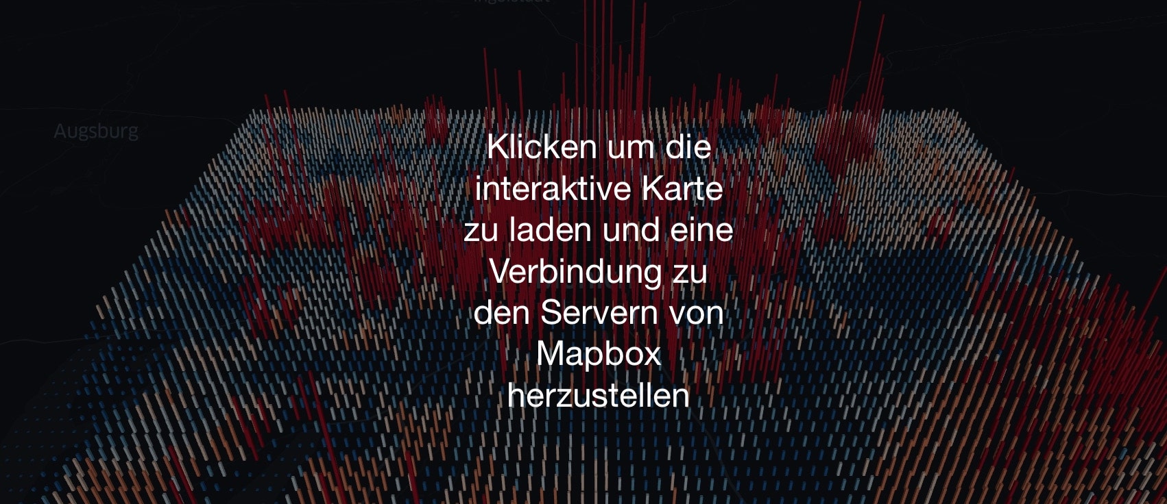
For example, the greenhouse gas emissions in Munich are visualised in an interactive 3D map. You can quickly see where the strongest methane sources are located by dragging the map with the mouse. If you also hold down the Ctrl key, you can pan the map in 3D.
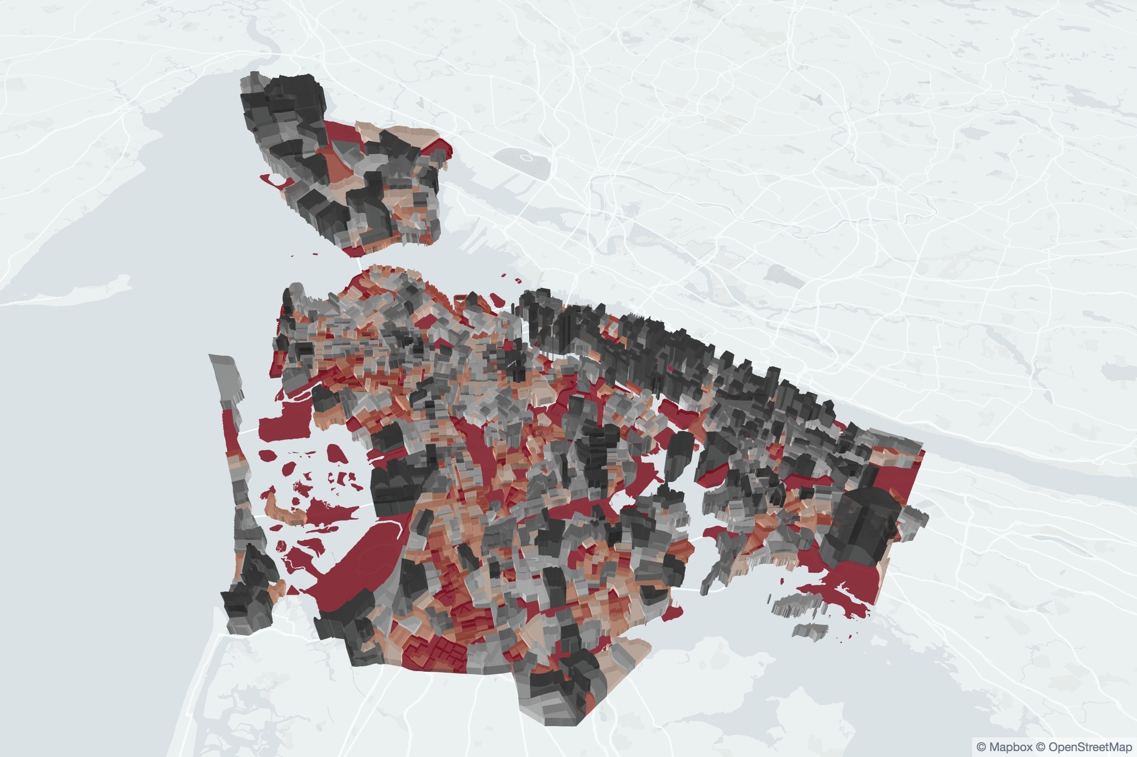
Below, random data has been visualised on a different base map. For further possibilities of visualisation, please contact me to find a solution for your geographical data sets.
The emission data come from a data set of the TNO emissions inventory.